Why Does Custom Packaging Design Influence Consumer Purchase Decisions?
Packaging is far more than a protective shell; it is a critical decision interface. In the modern retail environment, whether physical or digital, a product's packaging is often its most visible media channel. Design decisions made during the custom packaging design process directly influence recognition, trial, and repeat purchase. According to a 2018 Ipsos survey, 72% of American consumers stated that their purchase decisions were influenced by a product's packaging design.
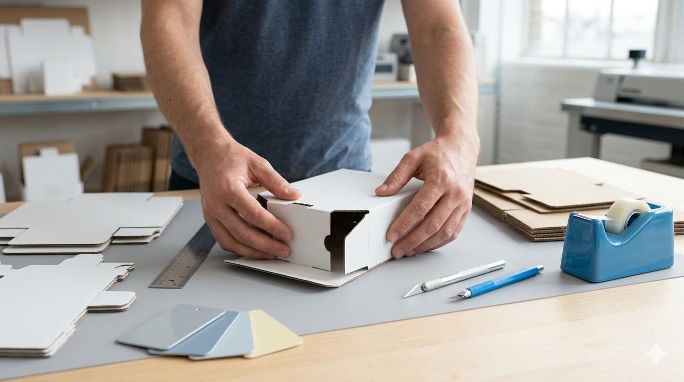
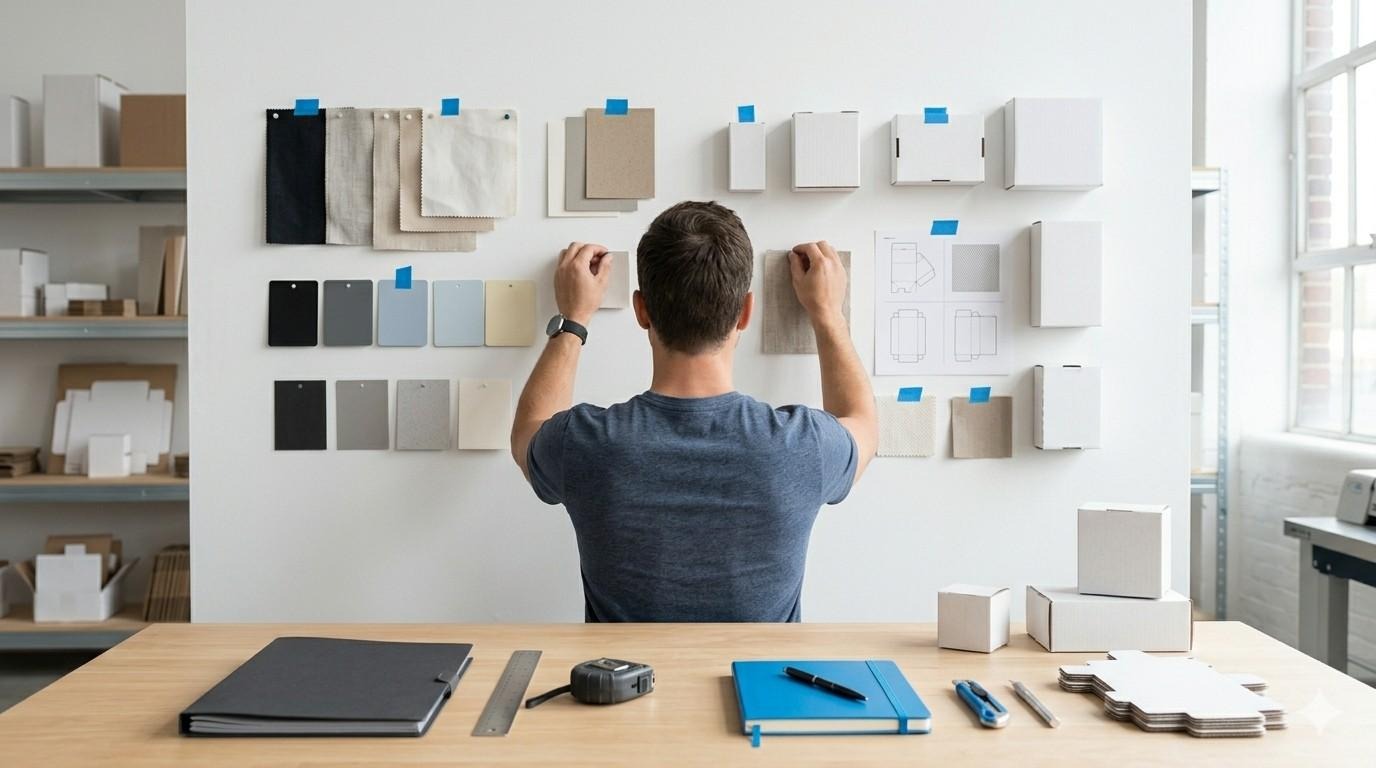
Custom packaging design is a structured process blending strategy, aesthetics, and production constraints. It is not merely about creating a visually pleasing box; it is about engineering an experience that communicates value, functionality, and brand identity in an instant. This guide will delve into the principles, psychology, typography, dielines, technical specifications, artwork preparation, and an end‑to‑end workflow with case studies and actionable checklists.
How Do You Define The Strategy For Custom Packaging Design?
A strong design brief anchors the entire custom packaging design process. Without a clear strategy, even the most beautiful design will fail to perform commercially. The strategy phase must map out category conventions and competitive shelf positioning without losing the brand's unique voice.
Understanding the target shopper's insights is paramount. Are they looking for premium cues, eco-friendly materials, or bold, disruptive aesthetics? Price tier signals must also be carefully calibrated; a value product should not look over-packaged, while a luxury item must justify its price point through tactile and visual cues. Furthermore, channel constraints play a significant role. E-commerce packaging must survive shipping and provide an unboxing experience, whereas retail packaging must stand out under harsh fluorescent lights and compete directly with adjacent products.
Most purchase decisions occur in seconds at the shelf; therefore, the primary goal is fast recognition. Key Performance Indicators for packaging often include recognition speed, readability, and waste reduction.
Brief Template Essentials:
- Problem Statement: What specific challenge is the packaging solving?
- Audience: Who is the primary consumer, and what are their purchasing drivers?
- Constraints: Budget, timeline, materials, and regulatory requirements.
- Success Metrics: How will the effectiveness of the design be measured?
What Are The Design Principles That Drive Choice In Packaging?
Design principles in custom packaging design are not just aesthetic guidelines; they are functional tools that drive real-world consumer decisions. Brand assets such as logos, colors, and distinctive shapes must be deployed strategically to build visual hierarchy.
Distinctiveness must be balanced against category codes. While it is important to stand out, consumers still need to recognize what the product is. Simplicity and white space are powerful tools for information chunking, allowing the consumer's eye to navigate the package logically without feeling overwhelmed.
Two critical tests for effective packaging design are the “3‑Second Read” test and the 1‑meter legibility check. If a consumer cannot understand what the product is and why they should buy it within three seconds from a distance of one meter, the design has failed its primary objective.
Visual Hierarchy Mini-Checklist:
- Establish a clear focal point.
- Ensure high contrast for critical information.
- Provide adequate breathing room (white space) around key elements.
- Prioritize claims based on consumer importance.
How Does Color Strategy And Psychology Impact Shelf Recognition?
Color strategy is arguably the most visceral component of custom packaging design. It influences the first impression, signals the product category, and aids in variant navigation (e.g., differentiating flavors or scents within a product line). Research demonstrates that color plays a significant role in attention and memory encoding. For instance, consumers often respond with a feeling of calmness to cool colors, whereas warm colors are more likely to stimulate excitement or urgency.
When transitioning from digital design to physical production, understanding the difference between CMYK and spot colors is crucial. CMYK (Cyan, Magenta, Yellow, Black) is used for full-color printing, but it has a limited gamut compared to the RGB colors seen on screens. Spot colors (like Pantone) are pre-mixed inks used for precise color matching, essential for brand consistency.
The substrate, the material being printed on, heavily influences the final color. Kraft paper will absorb ink differently and darken colors compared to coated white board. Metallics and clear films require specific under-color considerations, such as a spot white layer, to ensure colors remain opaque and vibrant. Coatings and special finishes, such as varnish, foil stamping, or embossing/debossing, affect both the perceived quality and the contrast of the packaging.
Accessibility must also be considered. Relying solely on color to differentiate products can alienate color-blind consumers. Contrast ratios must be sufficient to ensure legibility, particularly in low-light retail environments.
Color Printing Comparison

What Are The Best Practices For Typography On Small Packaging Surfaces?
Typography on packaging presents unique challenges. Text must remain legible on surfaces that may be curved, flexible, or textured. Type selection cannot be based on aesthetics alone; it must prioritize readability without compromise.
Minimum type sizes vary depending on the print method, but generally, text should not fall below 6 to 8 points for regulatory copy, and often larger for critical information. The FDA, for example, recommends that the font size should be no smaller than 10 points for certain sections of Instructions for Use labeling, with a minimum of 8 points for tables.
When selecting fonts, consider the x-height (the height of lowercase letters). Fonts with larger x-heights are generally more legible at small sizes. Adequate spacing (kerning and leading) and manageable line lengths are essential for readability. Hierarchy must be established for claims, legal copy, and instructions, guiding the reader from the most important information to the fine print.
Typography Rules of Thumb:
- Use sans‑serif fonts for microcopy to maintain clarity.
- Avoid ultra‑light weights, which can disappear or break up during printing.
- Always test typography by printing at 100% scale.
- Ensure high contrast and adequate sizing for low‑light aisles and fast scanning.
What Are Packaging Dielines And Technical Specifications?
A dieline is the foundational blueprint of custom packaging design. It is a 2D vector file that dictates the 3D structure of the final package, showing exactly where it will be cut, creased, perforated, and glued. Understanding the anatomy of a dieline is critical for creating print-ready artwork.
Key components of a dieline include:
- Cut Lines: Where the material will be sliced.
- Crease/Fold Lines: Where the material will be bent.
- Bleed Area: The zone outside the cut line where artwork must extend to ensure no unprinted edges occur due to slight shifting during cutting.
- Safety Margin: The zone inside the cut line where critical text and graphics must be kept to avoid being trimmed off.
- Glue Zones: Areas that must remain free of ink or varnish to ensure adhesive bonds properly.
Tolerances and printer minimums must be respected. Trapping, the slight overlapping of adjacent colors, is often necessary to prevent white gaps caused by minor misregistration on the press. Structural decisions vary wildly by format (folding carton, corrugate, label, flexible pouch, rigid box), and each format dictates specific artwork adjustments.
Dieline Preflight Checklist:
- Layers named clearly (Artwork, Dieline, Varnish, etc.).
- Units consistent (e.g., all in millimeters).
- Bleed and safety margins set correctly.
- Glue zones clear of ink/varnish.
- Barcodes placed in scannable locations.
- Special finishes (varnish/white ink) on separate, clearly labeled layers.

How Do You Prepare Packaging Artwork And File Formats For Print?
Preparing artwork for custom packaging design requires technical precision to ensure files print cleanly. Vector graphics (like Adobe Illustrator files) should be used for logos, typography, and solid shapes to ensure infinite scalability and crisp edges. Raster images (like photographs) must be high resolution, typically 300 ppi (pixels per inch) at their final printed size.
Color modes must be strictly managed. All artwork must be converted from RGB to CMYK or designated as specific spot colors. Linked assets must be included or embedded, and text should generally be outlined to prevent font substitution errors, though some printers may require live text with fonts supplied.
Overprint and knockout settings must be verified. Rich black builds (adding percentages of cyan, magenta, and yellow to black ink) should be used for large solid black areas to achieve a deep, velvety appearance, rather than a washed-out charcoal grey. Spot white layers are essential when printing on clear films or metallic substrates to provide an opaque base for other colors.
Artwork Export Checklist:
- Export using PDF/X standards when required by the printer.
- Ensure correct color profiles are embedded.
- Include crop and bleed marks.
- Note trapping policy if handled by the designer.
- Avoid RGB and low‑res images entirely.
- Confirm Pantone callouts if spot colors are used.
What Is The Design‑to‑Production Workflow For Packaging?
The transition from design to production is a critical phase where theoretical design meets physical reality. The workflow typically involves internal reviews, rigorous prepress checks, and a series of proofs.
A soft proof (digital PDF) is usually the first step to check layout and text. This is followed by a contract proof (a high-quality physical print) used to verify color accuracy. It is vital to review proofs under standard lighting conditions (typically D50 lighting) to ensure accurate color evaluation. For critical brand colors, drawdowns (ink samples printed on the actual chosen substrate) may be required.
Understanding the implications of different print processes, offset, flexo, digital, gravure, is necessary to align expectations with budget and volume. For instance, flexography is common for corrugated boxes and flexible packaging but has different tolerance requirements than high-fidelity offset printing used for premium folding cartons. The final steps include on‑press approval and first‑article inspection to validate that the mass production matches the approved proofs.
Handoff Checklist:
- Maintain strict version control of all files.
- Provide a comprehensive Bill of Materials.
- Include detailed finishing notes (e.g., matte UV, gloss spot varnish).
- Specify pallet labeling requirements.
- Establish Quality Control sign‑offs.

How Do You Ensure Compliance And Correct Barcode Placement?
Compliance is a non-negotiable aspect of custom packaging design. Late compliance changes are costly and can disrupt the entire production timeline. Designers must build “compliance real estate” into the layout from the beginning.
Regulatory copy zones must accommodate net contents, ingredient lists, warnings, and disposal/recycling marks. Language and localization planning is crucial for products sold in multiple regions.
Barcode placement is governed by strict standards, such as those set by GS1. Barcodes require a quiet zone, a clear, unprinted area surrounding the barcode, to ensure accurate scanning. They must also have sufficient contrast, typically dark bars on a light background.
Information Architecture Template:
- Primary Display Panel: Brand logo, product name, key variant, net weight.
- Information Panel: Nutrition/Supplement facts, ingredients, warnings, company address.
- Secondary Panels: Brand story, usage instructions, cross-selling information.
- Base/Bottom: Barcode, batch codes, recycling symbols.
What Are Some Case Studies Showing The Commercial Impact Of Packaging Design?
The true value of custom packaging design is measured by its commercial impact. Here are three anonymized case studies demonstrating how strategic design choices lead to measurable outcomes.
Snack Brand Refresh
A mid-tier snack brand was suffering from low shelf visibility and consumer confusion between flavor variants. The redesign focused on stronger color blocking and a simplified visual hierarchy.
- Outcome: The clearer distinction increased at‑shelf recognition speed. In store trials, mis‑picks (consumers grabbing the wrong flavor) were significantly reduced, leading to higher customer satisfaction and repeat purchases.
Skincare Set Relabel
A skincare line received frequent customer service queries regarding ingredient details, which were printed in a light, condensed font. The packaging was relabeled with a larger x‑height font and a reflowed International Nomenclature of Cosmetic Ingredients panel to improve legibility.
- Outcome: The improved typography directly reduced customer service queries post‑launch, lowering operational costs and improving the perceived transparency of the brand.
Beverage Variant System
A beverage company with multiple SKUs experienced high picking errors in their fulfillment centers because the variant names were difficult to distinguish quickly. The design team implemented a system adding specific spot colors and high‑contrast cap labels for each variant.
- Outcome: The enhanced visual cues cut picking errors in fulfillment by 15%, streamlining logistics and reducing the cost of returns and replacements.
Great custom packaging design is the alignment of brand strategy with production reality. It requires a deep understanding of consumer psychology, aesthetic principles, and technical constraints. Design teams that prototype early, test legibility at shelf distance, and document specifications consistently will reduce costly rework, protect profit margins, and ultimately improve shopper clarity. By mastering the intricacies of dielines, typography, and color management, brands can turn their packaging into their most effective and persuasive media channel.
Frequently Asked Questions: Custom Packaging Design
What is a packaging dieline, and why is it critical?
A packaging dieline is a 2D vector file that serves as the blueprint for a 3D package. It shows exactly where the material will be cut, folded, and glued. It is critical because it ensures the artwork aligns perfectly with the physical structure, preventing text from being cut off or graphics from folding incorrectly.
CMYK vs RGB: which should I use for packaging artwork?
You must always use CMYK (Cyan, Magenta, Yellow, Black) for packaging artwork. RGB (Red, Green, Blue) is used for digital screens and cannot be accurately reproduced with printing inks. Designing in CMYK ensures the colors you see on screen closely match the final printed product.
What is the minimum font size for packaging legibility?
While it varies by print method and font style, the general minimum font size for packaging legibility is 6 to 8 points. However, for critical information or regulatory copy, 10 points or larger is recommended to ensure it can be easily read by all consumers.
How do I prepare artwork with spot white or foil layers?
Spot white, foil, or varnish layers must be set up as separate, clearly named layers in your vector design file (like Illustrator). They should be assigned a specific spot color (often a bright, contrasting color like magenta) and set to "overprint" so they do not knock out the artwork beneath them.
How much bleed and safety margin does packaging need?
Standard packaging requires a minimum of 3mm (about 1/8 inch) of bleed extending past the cut line. The safety margin should be at least 3mm inside the cut line to ensure no critical text or graphics are accidentally trimmed off during the manufacturing process.
What affects color consistency across substrates?
Color consistency is heavily affected by the substrate's material, color, and finish. Ink absorbs differently into uncoated kraft paper than it does into coated white board, often appearing darker or less vibrant. Using spot colors and requesting drawdowns on the actual material are the best ways to manage consistency.
How do I place and size barcodes correctly?
Barcodes must be placed in a scannable location, typically on the bottom or lower back of the package. They require a "quiet zone", a clear margin of empty space around the barcode, to scan properly. They should be printed with high contrast, usually black bars on a white background, and sized according to GS1 standards.
What steps are involved in a packaging press check?
A press check involves visiting the printing facility to approve the first sheets coming off the press. Steps include verifying color accuracy against contract proofs, checking registration (alignment of different ink colors), ensuring text is crisp, and confirming that any special finishes (like foil or varnish) are applied correctly.