From roast to shelf: coffee packaging that protects and sells
A practical guide to custom coffee packaging, covering bag design, barrier materials, printing methods, finishes, and freshness protection to help roasters stand out and scale in competitive retail and online markets globally.
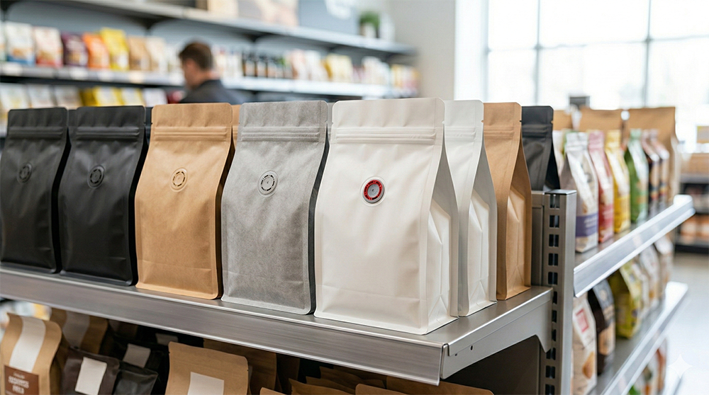
Shoppers judge your coffee in three seconds, on a noisy shelf or a small thumbnail. In those seconds, coffee packaging does the heavy lifting: it signals roast quality, protects aroma, and shows your operation is dialed before anyone tastes a sip.
If you’re a roaster, café, DTC brand, or co‑packer, the bag has to be more than attractive. It must hit oxygen and moisture targets, vent CO2 through a reliable valve, seal cleanly, and carry readable, compliant details, while running smoothly on your sealer or form‑fill‑seal line. The pitfalls are familiar: artwork that fights the dieline, colors that don’t print as expected, films that underperform, order plans that ignore lead times.
This guide maps the practical path from concept to a bag that looks sharp, preserves flavor, and runs reliably, connecting design choices to barrier specs, formats, finishes, sustainability, and ordering logistics. Start by defining what your bag must achieve for brand perception, freshness, and price positioning.
The High Stakes of First Impressions in Specialty Coffee
In specialty coffee, you don’t get a warm-up. A crowded shelf, or a grid of one-inch thumbnails, gives your brand seconds to earn attention. Before aroma, before tasting notes, before brew method, shoppers decide whether your coffee looks worth their money. That first glance sets expectations for flavor, price point, and professionalism.
Why Packaging Signals Quality Before Taste
Packaging acts as a proxy for what’s inside. Nielsen’s Global New Product Innovation report found that 64% of consumers try a new product because the package caught their eye, clear evidence that design drives trial. In-store, that means color blocking that stands apart, text that reads under bright retail lighting, and a structure that holds its shape. Online, it means a front panel that works at thumbnail size and a secondary image that confirms origin, roast level, and format without zooming.
When the bag looks intentional and premium, shoppers assume the coffee is too.
How to Build a Strong First Impression with Your Bag
Strong first impressions are engineered, not improvised. Start with hierarchy: brand, coffee name, roast level, origin or blend, and net weight should resolve in seconds. Visual consistency across SKUs lowers cognitive load, helping customers compare options quickly. Contrast, font weight, and spacing must hold legibility under store glare and on mobile screens.
Finishes reinforce positioning. Matte soft-touch often signals premium craft. Metallic accents can hint at intensity or bold flavor. Clear windows can suggest freshness, if used intentionally and without compromising barrier. Every visual choice communicates price tier and brand maturity.
Form Meets Function: Design That Protects Freshness
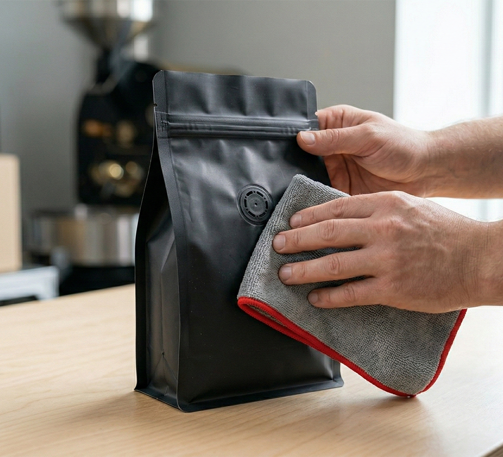
A coffee bag is not just a canvas, it is a preservation system. Oxygen and moisture degrade aroma compounds quickly, so structure and barrier matter as much as branding. Degassing valve placement, zipper reliability, seal integrity, and film choice determine whether the last cup tastes as good as the first.
When structure and identity are aligned, you avoid the common trap of a beautiful bag that underperforms in the pantry. Credibility comes from consistency, looking premium and delivering on freshness.
A Practical Path from Brief to Printed Bag
This guide outlines a clear process for building custom printed coffee bags that perform on shelf and online. You’ll:
- Align brand strategy with a focused packaging brief
- Choose a visual direction and prepare print-ready files
- Select materials and barrier structures that protect flavor
- Compare print methods and finishes by run size and budget
- Build an ordering model that fits your launch calendar and SKU count
Along the way, you’ll see how decisions like dieline selection, finish choice, and valve placement influence cost, speed, and perceived quality.
The Measurable Payoff
The upside is tangible. Clearer hierarchy reduces selection friction. Premium finishes can support higher price points. Strong barrier performance lowers waste and customer complaints. Internally, aligned design and structure reduce rework and make it easier for co-packers to run your bags without downtime.
When first impressions and functional performance reinforce each other, you build recognition, justify margin, and earn repeat purchase, without relying on discounting. With the stakes defined and the roadmap clear, the next section quantifies that impact and connects packaging decisions directly to shelf presence, brand recognition, and long-term growth.
The ROI of Custom Printed Coffee Bags: What Pays Back and Why
Well-designed, thoughtfully specified coffee bags do more than look premium, they influence how quickly shoppers notice you, how clearly they understand your offer, and how confidently they buy again. When treated as a commercial lever rather than a cosmetic upgrade, packaging delivers measurable returns across retail, DTC, and operations.
Shelf Impact Happens Fast
Most retail decisions happen in seconds. Distinctive color blocking, strong figure–ground contrast, and a clear brand mark in the top third of the panel shorten “time-to-notice” in crowded sets. Stable formats such as flat-bottom or quad-seal bags face forward cleanly, helping buyers spot your SKU quickly and increasing pick-up and trial.
Packaging Influences Willingness to Pay
In premium categories like specialty coffee, shoppers read material weight, finish, and print quality as cues of product quality. Matte or soft-touch laminations, disciplined typography, and crisp graphics support higher SRPs because they reinforce craft and care. Consumer research consistently shows packaging design meaningfully influences purchase decisions, especially when the price is above commodity tiers.
Clear SKU Differentiation Reduces Errors
Color-coded roast levels or origins, consistent panel layouts, and large, legible weight and roast callouts reduce confusion. This helps both shoppers and fulfillment teams. Roasters who standardize layout systems often see fewer mispicks in warehouses and fewer “wrong item” returns, saving time and preserving customer trust.
Thumbnail Legibility Drives DTC Conversion
For many customers, your bag first appears as a 1–2 inch thumbnail. Designs with strong contrast and a simple information hierarchy tend to perform better in A/B tests because key details, roast level, origin, bag size, are readable without zooming. When customers understand the offer instantly, click-through and add-to-cart rates improve.
Operational Efficiency Is Real Money
Built-in barcodes, GS1-compliant placement, and space for a small variable label (roast date, lot code) reduce manual handling. Even shaving a few seconds per unit compounds meaningfully at scale. Clear valve and zipper placement also improves line consistency, reducing rework and downtime on semi-automatic fill-and-seal setups.
Perceived Freshness Fuels Repeat
A reliable one-way valve, robust zipper, and scuff-resistant materials preserve both aroma and appearance. Adding a visible roast date and simple storage guidance reduces quality uncertainty, which strengthens second-order rates. When the bag looks and performs premium throughout its lifecycle, repeat purchase follows naturally.
Quick Before-and-After Example
A regional roaster upgraded from blank kraft bags with stickers to printed flat-bottom pouches featuring color-banded origins and a prominent roast-level icon. The redesign improved shelf navigation and facing compliance in grocery, and over eight weeks the brand saw a 15% lift in unit velocity alongside a 28% drop in online “which roast is this?” support tickets.
Great packaging earns attention, clarifies choice, and signals value, three factors that compound into velocity, margin, and loyalty. With the returns defined, the next step is translating brand positioning into a focused, testable packaging brief that guides design and structural decisions.
Coffee Packaging Printing and Finishes: What to Choose and What to Avoid
Printing is where strategy becomes physical, and where small mistakes become expensive. The wrong method, proofing shortcut, or finish choice can mean color drift, unreadable labels, scuffed panels, or even a full reprint. In coffee packaging, the right pairing of print process and finish protects brand color, controls unit cost, and keeps pouches looking sharp from filling line to customer pantry.
Picking the Wrong Print Method for Your Run Profile
A common misstep is choosing flexo or gravure for short, multi-SKU runs, or defaulting to digital for a stable, high-volume hero SKU.
- Digital excels for frequent artwork changes, seasonal drops, variable data, and lower per-SKU quantities.
- Flexographic or gravure shine when annual volume per SKU is high and colors remain consistent.
Ask your converter for the crossover quantity based on your structure. A typical scenario: eight SKUs at 2,000 units each often favors digital; a single SKU at 100,000+ units usually favors flexo or gravure for better unit economics.
Match method to forecast, not preference.
Trusting On-Screen PDFs Instead of Real Substrate Proofs
What looks vibrant on a monitor can print muted on matte films, soft-touch laminations, or metallized substrates.
Always:
- Request press proofs on the actual film and finish
- Provide Pantone targets or spectral values
- Define acceptable color tolerances (e.g., ΔE ≤ 3 for brand-critical hues)
Archive approved drawdowns in a shared color library to maintain consistency across future reprints.
Forgetting the White Underprint on Kraft or Metallized Films
Without a white ink layer, process colors sink into kraft or pick up a metallic cast, dulling brand marks, photos, and skin tones.
Best practice:
- Add a dedicated white plate beneath areas requiring opacity
- Define knockouts intentionally where you want kraft or metallic to show
- Label white as a separate layer in your print file and call it out clearly in notes
Opacity should be engineered, not assumed.
Designing Type and Barcodes Below Print-Hold Limits
Fine reversed text and hairline rules may look elegant, but they close up on press, especially on matte or textured finishes.
Follow minimum standards:
- Positive type: 7–8 pt minimum
- Reverse-out type: 9–10 pt minimum on matte
- Line weights: ≥ 0.3 mm
- UPC quiet zones: ≥ 2.5 mm on all sides
Avoid thin serif fonts in reversed copy. Always scan printed barcode proofs at size before approval.
Legibility beats ornamentation.
Underestimating Scuffing on Dark, Matte Areas
Large, high-coverage dark panels on soft-touch finishes show rub marks from case packing and shelf handling.
Mitigation options:
- Add a protective overprint varnish (OPV)
- Use satin or gloss blends in high-contact zones
- Incorporate subtle textures or micro-patterns to mask wear
Request rub and scuff testing (e.g., TAPPI 535) and, when possible, transit simulations before final sign-off.
Premium finishes must survive real-world friction.
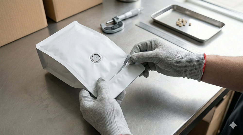
Ignoring Manufacturing Keep-Out Zones
Artwork that creeps into seal jaws, overlaps zipper tracks, or collides with valve placement can be crushed, distorted, or misaligned during production.
Build strictly to the dieline:
- Maintain 3–5 mm safety margins from seals and zippers
- Place valves in designated dead zones
- Align graphics with fold and gusset lines
- Confirm registration tolerance (e.g., ±1 mm)
Avoid cross-panel graphics that require perfect wrap alignment, real-world tolerances exist.
Getting printing and finish decisions right prevents color surprises, unreadable panels, and costly waste. Establish a disciplined proofing and validation routine once, and every reprint that follows will land closer to target, with fewer revisions and smoother launches
Building a Scalable Coffee Packaging Roadmap
Great packaging isn’t just a print file, it’s a system that supports launches, compliance, storytelling, and scale. If you step back and plan strategically, your bags can serve next quarter’s product drop and next year’s expansion without constant redesign.
Plan for Changing Regulations and Retail Rules
Packaging laws and retailer standards are evolving. Several U.S. states have passed extended producer responsibility (EPR) laws, and recyclability criteria and fees will continue to roll out.
What to do now:
- Design toward mono-material PE where practical
- Document your material structure clearly
- Pre-approve recyclability claims and labels
- Lock baseline specs (materials, OTR/WVTR targets, valve performance)
- Maintain a change log so updates don’t disrupt compliance or shelf life
When your specifications are documented and defensible, scaling becomes simpler, and less risky.
Use the Bag as a Data Platform
Your pouch isn’t only a print surface; it’s a data surface.
With the industry moving toward 2D barcodes (GS1 “Sunrise 2027”), a single code can support:
- Point-of-sale scanning
- Lot-level traceability
- Consumer-facing content
Combine that with digital printing to localize roast dates, lot numbers, and QR destinations by SKU or batch. A micro-lot bag can link to a farm story and brew guide. A grocery SKU can route to freshness FAQs or a store locator, without redesigning the entire bag.
Smart data integration keeps your base artwork stable while content stays flexible.
Design for Shelf and Screen
Your bag must work in two places:
- From three feet away on a shelf
- At 200–300 pixels on a phone
Build thumbnail testing into your proofing process. Validate contrast on your chosen substrate. Choose finishes that resist scuffing in fulfillment and shipping.
Operationally, standardize hardware wherever possible:
- Use consistent zipper types
- Keep valve placement uniform
- Align gusset dimensions across sizes
This makes today’s semi-automatic filling smoother and prepares you for form-fill-seal equipment when you scale.
Think in Systems, Not SKUs
When you treat packaging as a living system, decisions get clearer:
- Which SKUs deserve fully printed bags
- Where master bags + labels reduce inventory risk
- How to meet retailer or platform rules without redesign
- Which print method matches your launch cadence
Instead of reacting to change, you’re building a structure that absorbs it.
Strong packaging strategy isn’t about predicting every shift. It’s about designing flexibility into materials, data, and operations so you can move from plan to first order, and from first order to national scale, with confidence.
Conclusion
Thoughtful coffee packaging is more than a bag; it’s your brand in a customer’s hand. When your design reflects who you are, essential details are clear, and the material and format protect freshness, every bag works like a small storefront, drawing attention, signaling quality, and inviting the first purchase. The path is straightforward: define the look, pick the right partners and bag styles, choose finishes and materials that fit your budget and timeline, and order in quantities that let you learn and refine. Start with one core product or a short run, gather feedback, and iterate, the result is packaging that travels well from roastery to shelf to doorstep and helps your coffee stand out where it matters most.
Red Dot Packaging can help you do exactly that. We manufacture custom printed pouches and rollstock in the U.S., with high-barrier films, degassing valves, zipper and finish options, and structures tuned to roaster and form-fill-seal requirements. Select free sample and we’ll ship a tailored kit matched to your product and equipment, plus guidance for quick test runs, so you can de-risk changeovers, reduce waste, and move to production with clarity.
Custom Coffee Packaging: Summary
Great coffee packaging isn’t just about looks. The materials, barrier levels, valves, print method, and labeling all work together to protect flavor, extend shelf life, run smoothly on your equipment, and convert shoppers on shelf or online.
Here’s what to specify, and why each choice matters.
1. Freshness Engineering: Protect Aroma and Shelf Life
Coffee stales when oxygen gets in and aroma escapes. Your structure must manage both.
Specify:
- Defined OTR (oxygen transmission rate) and WVTR (water vapor transmission rate) targets based on whole bean vs. ground
- A properly placed one-way degassing valve for roasted coffee
- Strong, consistent heat seals and zipper integrity
Ground coffee generally needs a lower OTR than whole bean because of greater surface exposure. Pair barrier performance with a correctly positioned valve and clean seams to protect aroma through the last cup, not just the first week.
2. Shopper Clarity: Make Decisions Easy
Customers decide fast, on a shelf or in a thumbnail.
Design with:
- A clear hierarchy: brand → coffee name → roast level → origin/blend → weight
- High contrast and legible type sizes
- Finishes that match your price point (matte for premium, gloss/metallic for bold or modern cues)
What reads from three feet away should also read at 200–300 pixels online. If shoppers struggle to identify roast level or bag size, friction increases and conversion drops.
3. Sustainability by Use Case: Match Claims to Reality
Different materials fit different business models.
- Mono-material PE: strong barrier, reliable seals, compatible with valves and zippers; often labeled “recyclable where facilities exist.” Good fit for retail programs.
- Certified compostables: best for fast-turn whole bean programs with shorter shelf life. Less suited to long distribution or ground coffee.
- Paper-forward laminates: premium aesthetic with good barrier, but rarely recyclable as paper. Focus on accurate sourcing and disposal language.
Align claims with the FTC Green Guides and real infrastructure. Avoid vague terms like “eco-friendly.” Be precise.
4. Compliance and Labeling: Get the Basics Right
At minimum, U.S. coffee bags should include:
- Net weight
- Roaster name and address
- Lot code or roast date
- Ingredient statement (if flavored)
- Proper certification marks (if applicable)
Disposal claims must reflect actual access to recycling or composting. QR codes and barcodes should be placed on flat areas with adequate quiet zones and tested after filling to ensure they scan reliably.
5. Print and Production Readiness: Prevent Reprints and Waste
Match print method to volume and SKU complexity:
- Digital for short runs, seasonal SKUs, and variable data
- Flexo or gravure for higher volumes and stable designs
Always:
- Approve press proofs on the actual film and finish
- Set Pantone targets and color tolerances
- Respect keep-out zones around seals, valves, and zippers
- Add scuff-resistant coatings in high-friction areas
Small oversights in print prep often become expensive corrections later.
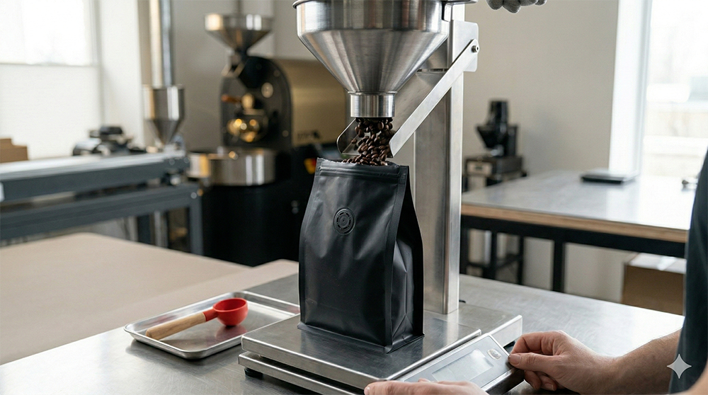
Before You Commit: Validate on Your Line
Run fill, seal, and line-speed trials with your actual beans. Confirm:
- Seal strength
- Valve performance
- Zipper function
- Stand-up stability
- Overall machinability
Then document a standard specification, including structure, OTR/WVTR targets, hardware placement, and approved finishes, so future orders stay consistent.
Prepare for GS1 2D barcodes (Sunrise 2027) as part of your roadmap. A single code can simplify POS scanning, traceability, and consumer engagement without redesigning your entire bag.
Custom Coffee Packaging FAQs
Q: What do OTR and WVTR mean for coffee packaging, and how do they affect freshness?
A: OTR (oxygen transmission rate) measures how much oxygen passes through a film over time. WVTR (water vapor transmission rate) measures how much moisture passes through. Lower numbers mean stronger barriers. Oxygen drives staling and flavor loss, so ground coffee, being more exposed, typically needs a lower OTR than whole bean. Set clear targets with your supplier and confirm performance with real-time storage testing, not just lab data.
Q: Do I need a one-way degassing valve for roasted coffee, and where should I place it?
A: Yes. Freshly roasted coffee releases CO₂, which can swell or stress a sealed bag. A one-way valve lets gas escape without letting oxygen in. Place it near the top of the front or back panel on a flat area, away from seams, zippers, and fold lines. Follow the dieline’s keep-out zones and test valve performance with your actual roast profile to confirm proper flow and seal integrity.
Q: Which packaging material is best for retail timelines: mono-material PE, compostable, or paper-forward laminates?
A:
- Mono-material PE works well for most retail programs. It can achieve strong barrier performance (including low OTR for ground coffee), seals reliably, and supports valves and zippers. Claims typically read “recyclable where facilities exist.”
- Certified compostables are better suited to fast-turn, short shelf-life whole bean programs. They are generally less ideal for long distribution or ground coffee.
- Paper-forward laminates provide a premium, craft look and strong barrier but are rarely recyclable as paper. Position sustainability claims carefully and focus on responsible sourcing where applicable.
Q: Are compostable coffee bags right for my brand?
A: They can be, if your product turns quickly, you primarily sell whole bean, and your audience values compostability. Keep in mind that compostable films often have tighter sealing windows and barrier limits. Use precise claims like “industrially compostable,” and note that access to facilities may vary by region.
Q: What information must appear on a coffee bag to stay compliant in the U.S.?
A: Include:
- Net weight
- Roaster name and address
- Lot code or roast date
- Ingredient statement (if flavored)
If certified (e.g., organic or fair trade), ensure marks meet licensing rules. Sustainability claims should align with FTC Green Guides and reflect actual local recycling or composting infrastructure. All required information must remain legible on your chosen substrate.
Q: How should I choose between digital, flexo, and gravure printing for coffee pouches?
A:
- Digital is best for short runs, frequent artwork updates, and variable data (like roast dates or QR codes).
- Flexo or gravure work better for higher volumes and stable designs where lower unit cost and color consistency matter.
Always approve press proofs on the actual film and finish. Set Pantone targets, define color tolerances, and confirm minimum type sizes and barcode specs before final approval.
Q: How can I keep colors accurate and text legible on kraft or metallized films?
A: Add a white underprint beneath areas where you need clean, accurate color or small text. Without it, designs can look dull or shift tone. Confirm contrast under real lighting conditions and review physical proofs, not just PDFs. Follow vendor guidelines for minimum type sizes and barcode quiet zones.
Q: What should I test on my sealer or form-fill-seal line before committing to production?
A: Run full line trials with your actual beans to verify:
- Seal strength and consistency
- Zipper alignment and function
- Valve performance
- Stand-up stability
- Line speed compatibility
Document a standard specification, including structure, barrier targets, hardware placement, and finishes, so repeat orders remain consistent.
Q: How can I make QR codes and barcodes scan reliably on coffee bags?
A: Place codes on flat, low-gloss areas with strong contrast and adequate quiet zones. Keep them away from seams, zippers, and curved gussets. Test scanning after filling to account for wrinkles or curvature. Plan ahead for GS1 2D barcodes (Sunrise 2027), which allow one code to handle POS, traceability, and consumer engagement.
Q: What finishes and protective coatings should I use to match price point and prevent scuffs?
A:
- Matte or soft-touch often signals premium quality.
- Gloss or metallic accents can communicate boldness or intensity.
Dark matte areas are prone to scuffing, especially during fulfillment. Add scuff-resistant coatings in high-contact zones and request handling tests before approval. The finish should reinforce your price point, and survive real-world friction.